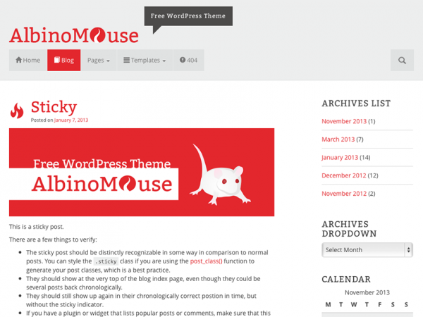
I am pleased to introduce you to my first free WordPress theme «AlbinoMouse». Funny name, isn’t it? The name is based on the look of a small white mouse. The size of the animal symbolizes the minimalist style. The white fur of the mouse stands for a bright and clean design. The distinctive, red eyes represent a variable, bright color used for hyperlinks and the footer background.
ALBINOMOUSE ADVANCES TO THE SECOND ROUND
As version 1.4. was not added to the repository on wordpress.org, I decided to completely redesign AM. AM is now based on the Bootstrap 3.0 framework. The design is changed particularly in its navigation, but the minimalist style is maintained and improved.
The integrated shortcodes and social media buttons had to be removed, due to the theme guidelines.
Themes must not incorporate the following plug-in-territory functionality.
– Content sharing buttons/links
– Custom post-content shortcodes
– …
These limitations make sure the user can change a theme without obstacles. This is understandable, but it might be inconvenient for those who already use the first AM version.
Since the shortcodes of version 1 are no longer working, they must be deleted from the posts and pages.
To make sure the contents can still be inserted using shortcodes, I recommend installing theBootstrap Shortcodes plug-in. This allows you to use the grid system, buttons and the Glyphicons icon font – without any knowledge of the code.
To continue using appropriate social share buttons, I added an optional stylesheet. The stylesheet adapts the appearance of the multi-plug-in Jetpack to the AM theme.
THEME DESIGN
AM’s design is minimalist and clean. The backgrounds consist of light, transparent and gray areas. The color of the texts is a dark gray and the size provides for good readability. In addition, a color can be defined which is used for all links and the footer background.
RESPONSIVE THEME
The output of AM automatically adapts to the end device. A website should be just as readable on mobile devices without the user having to take any actions. Media queries help loading different styles, depending on the screen size.
BROWSER COMPATIBILITY
![]()
AM operates with HTML 5 and CSS 3. Up-to-date browsers show an AM website without any display problems. Older browser versions, especially the Internet Explorer, may show discrepancies.
THEME OPTIONS
The theme options of AM offer numerous possibilities to adapt the theme to your own needs. A complete listing of various options can be found in the documentation.


