
About Esatto
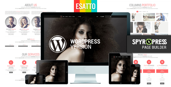
Esattois a One Page responsive WordPress Theme built with Bootstrap. 100% Customizable
Fully Responsive Design
Esatto can automatically adapt to many screen sizes thanks to its responsive capabilities. Try resizing your browser window or click on given link to see the adaptation. Even better is that Esatto’s sliders is also fully responsive. Every element has been tweaked for different screen sizes to make sure it looks great no matter what the device. Now people can easily browse your site using smartphones, tablets, laptops or desktop computers.


- One Page template
- Spyropress Drag & Drop Page Builder
- 5 Responsive different layout resolution (1170px – 940px – 768px – 480px -320px)
- SuperSlide 100% Responsive (it adapts to the any resolution of your browser)
- 2 main color variants (black or white)
- 5 secondary colors
- Masonry script
- Fancybox script
- Filterable Portfolio
- Static and fixed Navbar
- Google Map integration (fully formatted)
File not included
Products image and Banners are not included in the download files
PSD or PNG file not included in the download files
No PHP file are included in the download files


