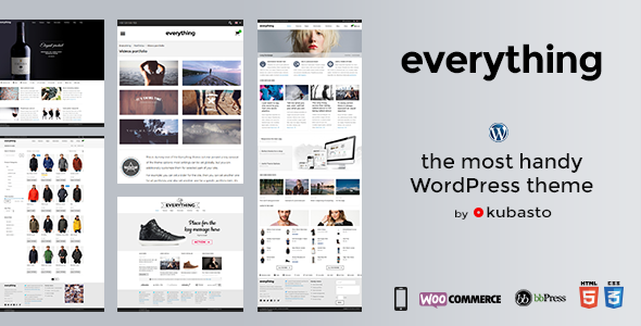
Everything is a powerful multipurpose responsive theme suitable for a variety of site types: creative portfolio, big corporate site, personal blog, product-oriented site, video & photo album – you name it.
You can sign in to a newsletter with ideas and solutions for websites built with the Everything theme to get inspirations and ready to use resources from theme’s author directly to your email.

The theme is prepared for a variety of uses. From simple blog to a magazine site.
You can browse a few examples of layouts on the demo site, but you can create your custom layouts easily. You can also set any site size, any sidebars sizes and it’s always nicely responsive.

There are 2 main schemes – bright and dark. You can combine any of them with any leading color. Additionally you can customize colors of site elements (like footer, topbar, content, texts, links, etc) in the Theme Options. I’ve prepared a few simple examples ›

I’ve won a contest for the best implementation of the WooCommerce plugin.
Everything theme means 100% WooCommerce support + some theme-specific bonuses.

The key concept of the theme is that most settings can be set globally, and additionally you cancustomize them for selected parts of your site. For example: you can set a banner for the entire site, then you can set another one just for portfolios, and also set another one for a specific portfolio item.
It’s very easily manageable and gives you a lot of customization power. This type of global / specific customization is possible for such aspects of a site as: layouts, backgrounds, sliders, sidebars, footers, headlines etc.

Everything is a responsive theme, which means it adapts to the device on which it’s displayed. The theme cares for your content so it looks great on all devices, but you can also decide to show part of a content on one version only and hide on other.
Retina is a commonly used phrase to describe displays with high density of pixels. For such devices, images need to be treated in a special way, so that they look sharp on this kind of displays. Everythingtheme does that, so your site and its content looks perfect on iPhones, MacBooks and new smartphones.

Boxed and opened layouts can be set for the whole site, for some part of it (for example just for a shop or a specific category) or just for one page. Sidebars, footers and banners are configurable independently and work seamlessly with both those main layout concepts.

You can select your favorite one, use all of them at once or ignore them. For a simple photo slider, you can use one of the theme’s gallery styles, which creates a slider with no effort at all.

No plugin is required for this. Build your menus hierarchically as usual and decide if you want them to be mega menu style. If you want menu items with icons – no problem too.

Custom background for the whole site, for some part of it (for example just for blog) or for a specific page only – no problem. Additionally content opacity can be set at 0-100%.

Fixed to the top, transparent, shrinking – these are 3 main options to play with. Header menu, top bar menu, secondary menu – these options add even more customization options to the header. Colors are easy to change too, of course. Watch a few examples of headers created in the Everything theme.

You can have a multi-language site with Everything theme. Polylang plugin and WPML plugin are fully supported. Additionally, if your WordPress is in English, Spanish, German or Polish, you’ll automatically see all theme settings in the dashboard in your language.

Classic or masonry? One column or more? Sidebars? You can customize it individually for each blog (you can have many blogs on one site). Meta data, social buttons, author bio – select what you need. All post formats are also nicely supported (audio, gallery, quote, status, etc…).

Portfolio items can have any content. And you can use those items to build portfolios, which you can style many different ways. Have a look at a few examples of portfolios on the demo site.

Full Google Fonts library is available, but you can also upload your fonts and use for anything on a website.

Everything is built to fulfill requirements of all modern web standards. It’s HTML5 + CSS3 piece of top quality code. Everything is optimized for speed and accessibility.
Notice: PHP 5.3+ is required for the theme to work.

It’s quite a unique feature and a great way to present important things on your site. Any number of tabs can be created this way. Have a look at more Super Tabs examples.
![]()
There are hundreds of vector and graphic icons (in a few sets) included in the theme and you can upload custom ones to media by yourself, so you can use them the same way as the built-in icons.

Extended features list
- 100% Responsive Theme (on or off)
- Fluid
- Retina Ready (ultra-high resolution images support)
- Boxed or open layout
- Powerful Theme Options
- Any size of a site (and still full responsiveness)
- Unlimited sidebars (of any width)
– left sidebar
– right sidebar
– 2 left sidebars
– 2 rigt sidebars
– left + right sidebar – no sidebar (full width page) - Bright or dark color scheme
- Any site leading color
- Advanced header options
– fixed to top option
– opacity option
– shrinking option
– left or centered logo
– top bar
– many menus - Breadcrumbs
- Translation ready (.po/.mo) + 4 full theme translations included:
– English
– Spanish
– German
– Polish - Multi-languages (full Polylang and WPML plugin support)
- Contact form (+ Contact Form 7 plugin support)
- Child theme ready (includes dummy child theme)
– many filters for better control - 3 slider plugins included
– LayerSlider by kreatura
– Master Slider by averta
– Revolution Slider by themepunch
– classic slider - Super Tabs
- Custom backgrounds (global or for individual pages)
– color
– image
– pattern - Advanced portfolio options
– many layouts (including masonry style)
– filtering
– categories - Audio and video support (self-hosted or embedded)
- Pagination
- Threaded Comments
- Advanced blog options
– classic or masonry layouts
– post formats (image, video, audio, quote, status, …)
– customizable meta (tags, permailink, categories, comments count …)
– customizable social media buttons (Like, Tweet, +1, Pin, Linked in)
– optional author box - Customize each page individually
- Customize each category individually
- Customize each page type individually
- FAQ Page
- About page
- Team page
- Contact page
- 404 Page
- Advanced Menus
– 7 menu locations + language menu
– mega menu
– icons in menus - Advanced Typography Options
– customize any font on a site
– create unlimited font presets to use anywhere on a site
– Google Fonts, standard fonts, or upload your custom font - Option to hide / show part of a content on mobile or desktop devices
- Many content effects and styles
– buttons
– text highlights
– message boxes (closable or permanent)
– lists with icons
– icons
– ratings
– dropcaps
– tabs
– toggles
– dividers
– tooltips
– columns - Twitter widget
- Flickr widget
- Facebook Likebox widget
- Social media widget
- Contact form widget
- Page content widget
- Portfolio widget
- Custom favicon
- Custom copyright text
- Google Analytics Field
- Custom CSS/JS field
- Unbranded WordPress-style theme options
- Demo content import (XML file)
- Well organized, HTML5 and CSS3
- SEO optimized code
- Free lifetime updates
- Free support


