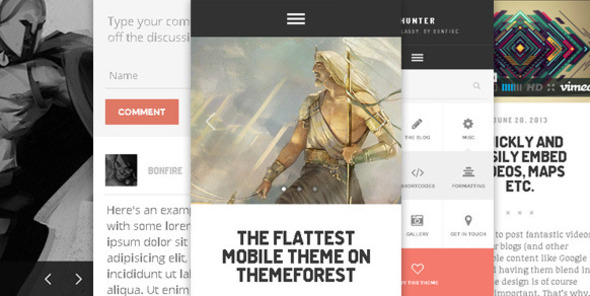
The flattest mobile theme on ThemeForest
‘Hunter’ is a WordPress theme intended for use on smartphone and/or tablet devices. You can set it up as a secondary theme and display it only to mobile visitors, or use it on a brand new installation; whichever suits your situation.
With plenty of features in tow, ‘Hunter’ can be used for many purposes; set up a straightforward blog, include an optional static front page, build portfolios and a touch-enabled galleries etc. Also included is a utterly unique comment form along with a validation-enabled contact form, ‘install as web app’ functionality on iOS, plus sliders, shortcodes and so on.
Killer support
As folks who’ve purchased our previous themes can attest to, we take good care of our customers. In fact, we’ll take a step back here and let them do the talking:
- “I’ve never had a customer service experience as great as I had with Bonfire Themes…”
- “You guys have the best customer service on Themeforest! A+++”
- “This is by far the best support I’ve gotten on TF.”
- “Best support I’ve ever seen! .. Five stars is not enough!”
- “… customer service provided goes above and beyond … An excellent experience from start to finish.”
- “Thanks a lot for your help – very quick!”
- “… extreme fast response!!!”
- “Wow, thanks for the prompt response.”
- “Excellent response time, man. Awesome service.”
- “Thank you very much for the super-quick support.”
- “Thanks for such a speedy response! You rock man!”
‘HUNTER’ works everywhere
‘Hunter’ is a thoroughly tested theme. iPhones and iPads, Android and Windows devices, even desktop browsers. It works everywhere. Should you use it as such, it can even functions as a full-blown desktop site.
To see it in action, please do have a look at the ‘Hunter’ demo site. And should you have any pre-sale questions, contact us directly through our ThemeForest profile, or submit your query on this theme’s comments section.
‘HUNTER’ works alongside your existing desktop theme
‘Hunter’ works alongside your existing desktop theme and can easily be shown to your mobile and/or tablet visitors only. To get a first hand look at the theme, visit the live demo site.
Features
- flat and clean design
- works alongside your desktop theme
- a very unique, very customizable 2-level accordion menu with icons (select from 350+ FontAwesome icons)
- ready for translation/localization (.mo, .po files included)
- ‘install as web app’ functionality on iOS (with install prompt, splash screens + icons!)
- a very unique, subtly animated comment form
- contact form with validation
- widgetized front page footer
- ready-to-edit child theme included
- a fully responsive liquid design that works beautifully on desktop, tablets and smartphones (everything from forms and fields to menus and embedded content is automatically resized to ensure your site looks its best on whatever device and resolution it’s being viewed on)
- tested on several browsers across multiple operating systems and devices (Chrome, Firefox, Internet Explorer, Safari, Opera, iOS, Android, Windows Phone)
- fully retina-ready
- beautiful and subtle use of CSS3 and jQuery animations
- includes themes for two different slider plugins
- touch-enabled gallery (customized PhotoSwipe)
- a ton of extremely customizable shortcodes: alerts, dividers, buttons etc.
- + shortcodes for YouTube, Vimeo, USTREAM, DailyMotion, Blip.tv
- + shortcodes for easily placing content in columns (text, images, as well as video)
- custom background tool enabled; change the theme’s background color/image in seconds
- extensive documentation
- PSD file included


