
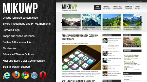
MikuWP is a simple, 3-column, magazine style WordPress theme with generic design suitable for various niches. Great for websites with lots of contents.
FEATURES
- Unique featured content slider
- Well-styled typography and HTML elements
- Portfolio Page
- Image and Video Galleries
- Built-in AJAX contact form
- Shortcodes that allow you to create columns, pullquotes, message boxes, tabbed-content and more.
- Advanced Theme Options panel (details below)
- Built-in Twitter Support
THEME OPTIONS
Under “Appearance”, you will find the “Theme Options” link. This provides you ease of customization. Theimage manager and media manager allows you to easily upload and manager image, video, and other media files which you can use in your theme. The options are sorted into six categories:
GENERAL
 Contact Email – Email address recepient of the AJAX contact form.
Image Gallery Thumbnail Size – Width and height of the image gallery thumbnails in pixels.
Video Gallery Thumbnail Size – Width and height of the video gallery thumbnails in pixels.
Home Link Text – Text that appears for homepage link.
Home Link Description – Text description that appears right below the homepage link.
Color Scheme – Change the primary colors of the theme.
Graphic Logo – The suggested size for the image is height of 60 pixels or less and width of 450 pixels or less. To upload an image, simply click the  icon next to the text field. This will open up the image upload window where you can upload and mange your images related to the theme.
Website Title – Appears as logo if no image logo is specified. To use secondary color, wrap the portion of the text with <em></em> tags.
Website Description – Appears below the Website Title.
Company Slogan – Text that appears at the top left of the page.
Default Field Values – Default text that appears on text fields and text areas such as search box and post/page reply forms.
Show Page Details – Show or hide author and date on page view.
Show Page Comments – Show or hide user comments on page view.
FEATURED SLIDER
 Show Featured Slider – Hides and displays the featured slider from the homepage.
Featured Category – The category name of the featured posts.
Number of Featured Posts – Number of featured posts slide to display.
Show Featured Posts Titles – Hides and shows the post titles of the featured posts on top of the thumbnail images.
FEATURED VIDEO
 Show Featured Video – Hides and displays the featured video from the sidebar.
Section Title – Title of the Featured Video section.
Video Player Root – Complete URL of flvplayer.swf Location.
Video Player Settings – FLV Video Player’s preferences such as width, height, and background colors (in hexadecimal).
Featured Video FLV – The URL of the FLV file to be played. Clicking the  icon shows the media manager pop-up window. This allows you to upload and manage media files.
Featured Video Image – The URL of the image file to be used as default screen. To upload an image, simply click the icon next to the text field. This will open up the image upload window where you can upload and mange your images related to the theme.
Featured Video Information – Text (i.e. description) that appears below the video player.
RECENT POSTS
 Show Recent Posts – Hides and displays the recent posts from the sidebar.
Section Title – Title of the Recent Posts section.
Number of Recent Posts – Number of recent entries to dislay.
Show Post Thumbnails – Hides and displays the thumbnail of each recent post.
Post Thumbnail Dimensions – Width and height of the post thumbnails in pixels.
Show Post Details – Hides and displays the details of each recent post.
POPULAR POSTS
 Show Popular Posts – Hides and displays the popular posts from the sidebar.
Section Title – Title of the Popular Posts section.
Number of Popular Posts – Number of popular entries to dislay.
Show Post Thumbnails – Hides and displays the thumbnail of each popular post.
Post Thumbnail Dimensions – Width and height of the post thumbnails in pixels.
Show Post Details – Hides and displays the details of each popular post.
RECENT COMMENTS
 Show Recent Comments – Show the Recent Comments section in the left sidebar.
Section Title – Title of the Recent Comments widget.
Show Recent Comments Thumbnail – Hides or displays the thumbnails in the Recent Comments Section.
Recent Comments Thumbnail Dimensions – Width and height of the recent comments thumbnails in pixels.
SIDEBAR ELEMENTS
 Show Google Ad – 200×200 Google Ad that appears at the top of the right sidebar.
Section Title – Title of the Advertisement section.
Google Ad Publisher ID – You may login to your Adsense account to find out your unique publisher ID.
Show Categories – Post categories list at the right sidebar.
Section Title – Title of the Categories section.
Show Blogroll – Blogroll list at the right sidebar.
Section Title – Title of the Blogroll section.
Show Archives – Archives list at the right sidebar.
Section Title – Title of the Archives section.
Show Meta – Meta list at the right sidebar.
Section Title – Title of the Meta section.
Show Text Widget – Text Widget at the right sidebar.
Section Title – Title of the Meta section.
Text Widget Content – The content of the text widget section.
BOOKMARKS
 Show Bookmarks – Hide or display all the bookmarks from the footer.
Section Title – Title of the Bookmarks section in the footer.
Show Facebook Link – Show or hide facebook icon link.
Facebook Link URL – The URL to your Facebook profile or fan page.
Facebook Link Description – A short description that appears below the Facebook link text.
Show Twitter Link – Show or hide twitter icon link.
Twitter Link URL – The URL to your Twitter page.
Twitter Link Description – A short description that appears below the Twitter link text.
Show RSS Link – Show or hide rss icon link.
RSS Link URL – The URL to your FeedBurner or other feed services. Leave for WordPress’ built-in RSS.
RSS Link Description – A short description that appears below the RSS link text.
Show WebShare Link – Show or hide webshare icon link.
WebShare Link URL – The URL to your WebShare subscription page.
WebShare Link Description – A short description that appears below the WebShare link text.
FOOTER ELEMENTS
 Show Latest Tweets – Show Latest Tweets widget at the leftmost side of the footer.
Section Title – Title of the Latest Tweets section.
Twitter Username – The twitter user whose status you want to display.
Number of Tweets – The number of tweets that you want to display. Maximum number is 20.
Show Text Widget – Text Widget at the footer
Section Title – Title of the Meta section.
Text Widget Content – The content of the text widget section.
Show About Us – Display the About Us section in the footer.
Section Title – Title of the About Us section in the footer.
About Us Image – The preferred dimensions are 225 pixels by 150 pixels. To upload an image, simply click the icon next to the text field. This will open up the image upload window where you can upload and mange your images related to the theme.
About Us Text – You may place a short description about you or your company here. You may use HTML to create links.
Copyright Information – Text that appears at the footer. You may use link <a></a> tags. For HTML special characters, wrap the keyword with braces (example: &[copy];).
COLOR SETTINGS
 Theme Color – Applies to logo’s secondary shade and footer links’ hover colors. Once you put the cursor in the field, a color picker will appear for easy color selection.
Logo Primary Text Color – Applies to logo’s default text color. Once you put the cursor in the field, a color picker will appear for easy color selection.
Main Links Color – The default link color which applies to almost all links in the content and sidebar sections. Once you put the cursor in the field, a color picker will appear for easy color selection.
Main Links Hover Color – Applies to default link hover color which applies to almost all links in the content and sidebar sections. Once you put the cursor in the field, a color picker will appear for easy color selection.
Header Text Color – Applies to company slogan and search input text colors. Once you put the cursor in the field, a color picker will appear for easy color selection.
Title Colors – Applies to the main logo text color, featured content title, post title, sidebar listings titles, subscribe links titles, and header navigation links. Once you put the cursor in the field, a color picker will appear for easy color selection.
Primary Text Color – Applies to default text color. Once you put the cursor in the field, a color picker will appear for easy color selection.
Secondary Text Color – Applies to active navigation text, sidebar and footer titles, footer text as well as the background color. Once you put the cursor in the field, a color picker will appear for easy color selection.
Secondary Background Color – Applies to upper footer background and featured content background colors. Once you put the cursor in the field, a color picker will appear for easy color selection.
Post Title Border Color – Applies to the horizontal border below the post title. Once you put the cursor in the field, a color picker will appear for easy color selection.
Sidebar Listing Border Color – Applies to list elements border color. Once you put the cursor in the field, a color picker will appear for easy color selection.


