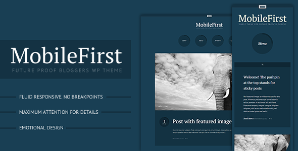
MobileFirst is a super simple and modern WordPress theme for bloggers with an eye to the style, and the other to the future. Perfect for a personal blog or a simple portfolio. It was developed with (all) mobile devices in mind, using the last available technologies, providing an awesome experience from smallest screens to larger desktop monitors.

Fluid responsiveness, no breakpoints. What does it mean? It means that MobileFirst is completely fluid, it won’t look good only on iPhones and iPads, it won’t jump to another size leaving plenty of white space while resizing your browser, it will just gracefully adapt to any viewport. Try it yourself!

Of course a theme named MobileFirst could not come without a retina screen support. The system will automatically detect the user’s screen pixel/ratio serving a high-resolution image when available.
*All icons are provided with a retina version already, or they use a font based system. That means your blog will look even smoother on retina displays, right out of the box!

MobileFirst comes with a complete Unbranded Options Panel that matches WordPress default User Interface to improve usability.

- HTML5, CSS3 and lightweight.
- Localized, includes .mo and .po Files
- Ajax comments (no page reload)
- Ajax load more posts (no page reload)
- Fully Scalable Embedded Video
- Fully scalable featured images
- Twitter Widget
- Regular and Retina Logo Upload
- Favicon upload
- Optional Sticky Prev Next navigation
- 20 Social networks ready to set from the Options Panel.
- Fully customizable typography with 500+ Google fonts
- Plain color, pattern or full-screen image backgrounds
- Fully customizable archives page
- Contact form template compatible with Contact Form 7 plug-in


