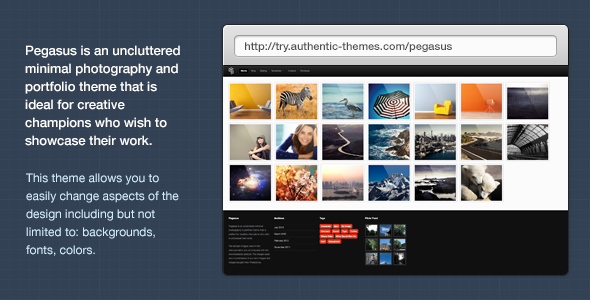
Pegasus is a responsive uncluttered minimal photography and portfolio theme that is perfect for creative heroes who wish to showcase their work without distractions. This theme uses the same classic design style as the Kraken theme has a similar layout structure and lots of customisable styling options.
Responsive Mobile & Tablet Support
The term responsive in the web design field is used quite a lot these days; although mostly incorrectly. Pegasus is a true responsive WordPress theme resizing the content to fit your numerous devices; whether it is a Mobile, tablet or a computer Pegasus is ready. We have tested Pegasus on the following mobile devices: iPhone 4, iPhone 4s, iPad 2, iPad 2, iPad 3 on Safari and Chrome. Don’t take our word for it try it out on your device.

8 Pre-Defined Colour Schemes
We have included 8 colour schemes: Black, Blue, Silver, Orange, Yellow, Green, Purple and Teal to give you push start on personalising your portfolio. You can have a look at these by going here and selecting a scheme via the navigation bar.
Portfolio or Mixed Blog / Portfolio Homepage
Pegasus allows you to either have the classic portfolio homepage or alternatively you can use a mixed blog and portfolio.
Authentic Social Widget
We have included the Popular Authentic Social Widget in the theme. You can see the social widget in action here.

Easily Customisable via the Theme Panel
We have made the essential typography, colours, backgrounds on this theme customisable by utilising the theme option panel to make your life easier if you are new to web design. You can even select through 480+ Google Web Fonts. Alternatively you can still edit these properties in the stylesheet. Take a gander at some of the styling options.


