We didn’t want for the demo to be heavy and boring, that’s why we share the first and most essential feature of the theme – the way it’s built.
WordPress is a platform, with thich we’ve been working for years and we’ve used tens of premium themes. We’ve been impressed by all of them with their incredible design. The troubles always tend to come once we deep into the administration and setup. The heavy and confusing design and functionality of the admin have always left us with bitter sweet taste.
We know that with Roki we managed to change precisely this. All the content and elements are manipulated in an extremely easy, simple and fast. We tried to cut down the time of going from one tab to another, in order to change the simplest of settings. We’ve put much thought in all the main components of work with the admin. People love WordPress because it saves time.
That’s why we gave our best – to make Roki a super easy to use theme.


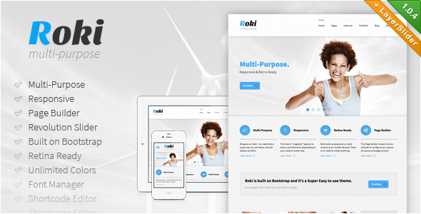
- Multi-Purpose
- Page Builder
- Responsive Design
- Revolution Slider
- Mobile-First
- Liquid Layout
- Built on Bootstrap
- Retina Ready
- Unlimited Color Options
- Adaptive Images
- Skin Manager
- Shortcode Editor
- Font Manager
- Unlimited Sidebars
Page Builder
The Page Builder makes it a one-click job to configure your layout structure, and page content.
With an easy-to-use drag and drop interface you can add unlimited number of layout elements, configure their presentation – as each element comes with its specific options to play with.
Resize each element to make it display as a single to four columned element on the layout. You can configure a more generalized look of your website from the Theme Options panel. This will affect all pages on your website. If you want dig deeper into customization – no problem. You can define the layout structure for your Portfolio and Blog pages from the Theme Options panel as well.
But if you want to be really specific – the page builder is available while editing each single page – you can create a unique look of your website and pages.
Responsive Design
Roki is an ultra responsive theme – we’ve put a lot of time and effort to make sure that regardless of their screen size each one of your visitors will be able to easily reach the information on your website.
Roki “magically” adjusts its layout and elements, depending on your visitors’ screen size – from mobile to desktop devices. Not only the layout is perfectly adjust for the appropriate environment, but the user interface makes it easy and intuitive for users with multi-touch devices to use native gestures they’ve grown so used to – swipe or touch.
Wide Layout
By changing a single option, you can totally change the look of your web site with a wide layout. If you don’t want to restrain your content and burden your users with information and various graphic details surrounding the content, you can easily setup your page, without affecting the clear and minimalistic design.
Boxed Layout
You might need your content to be centered – it’s an easy thing to set up with rocky – just modifying a single option. With the boxed layout you have an option to choose a background image, giving a new detail in freshness and clean design, suiting your business.
The powerful admin panel gives you the opportunity to tweak some fine settings, so the look of your site can reflect your corporate identity to its fullest.
For example with two simple sliding panels you can adjust the maximum width of your layout (the box) as well as the maximum width of your content, without the need to worry about the graphic elements and clean design.
Fluid Layout
Thanks to the powerful bootstrap front-end framework, roki is not simply a responsive theme, rendering natively on all devices – mobile, tablets or desktop, but features a fluid layout. You can adjust your content to always take up 100% of your visitor’s screen and each detail or box will “fluidly” adjust inside its context.
This is a solution, solving a lot of the problems with the screen of the device your users reach the information on your website.
Mobile-first Design
On a daily basis, the number of mobile devices increases, and therefore, the number of users who surf the web through them.
Your website needs to behave adequately in 100% of the times its requested – regardless of the device that renders your layout. In order to achieve maximum level of satisfaction from the usage of mobile devices, companies invest millions in developing mobile user interfaces and the majority of users get used to these interfaces in days, hence the mobile first design should be as much as possible these functionalities.
While developing Roki, we’ve invested a lot of time and effort, to get as close as possible to the intuition that users have developed from work with mobile operating systems.
Built on Bootstrap
Roki is built on Bootstrap – sleek, intuitive, and powerful front-end framework for faster and easier web development. Bootstrap is a renowned framework that features all major design elements. The whole Roki design is built on top of this framework and this gives you the possibility to use all of their elements, when publishing your posts or pages, and you will be certain that they won’t be in conflict with the initial Roki design. Bootstrap is packed with features, but more importantly – really easy to use from everyone! This gives you the power for quick and sleek design of your layouts.
Retina Ready
Roki looks as awesome on wide screens as on mobile devices. There is no need to install additional plugins to display cristal clear images on the new retina displays. All graphical elements, fonts, icons and textures that form the clean and beautiful design of Roki are optimized. Oh yes, we’ve added the feature to upload retina logo as well, so not a single component is left out, making everything look crisp and more lifelike. Text is razor sharp. Colors are vibrant. Photos and video are rich with detail.
Fontawesome Icons
Roki includes the packet of svg icons – Font Awesome – looking razor sharp on any screen and device.
Thanks to this package, we’ve made it possible to easily format the contents of your website, so that it is accessible, intuitive and understandable for all of your visitors.
At the same time, thanks to these over 200 svg icons, you keep the retina design of your theme and don’t overload your server with unnecessary images.
Unlimited Color Options
We understand the importance of your business identity. That’s why we’ve put a whole lot of time and energy, so that Roki can impose no limitations on colors of any graphical element, that build the fresh, clean and fine design of the theme.
You have the absolute freedom to choose the most-appropriate color scheme, while, regardless of your choice, the whole website will keep its characteristic clear and pure looks of the Roki template. Of course, this can be achieved in the simplest possible way – we realize how important it is for you to be able to manipulate theme options intuitively, without posing any trouble.
Roki gives you the possibility to adjust the color scheme, by modifying 4 main options, and if you feel the need for even finer touch – you have access to 2 additional options for the color palette of your main layout, and the container holding the content. Couple of selections and you have a brand new look of your website, as simple as that.
Revolution Slider
Roki includes a great premium plugin – Revolution Slider, $15 worth, and gives you the opportunity to benefit from tons of unique transition effects, an image preloader, video embedding, autoplay that stops on user interaction and lots of easy to set options to create your own effects.
With Revolution Slider you can create a responsive (mobile friendly) or full width slider with must-see-effects and meanwhile keep or build your SEO optimization (all content always readable for search engines). Thanks to ThemePunch.
Adaptive Images
Adaptive Images detects your visitor’s screen size and automatically creates, caches, and delivers device appropriate re-scaled versions of your web page’s embedded HTML images. No mark-up changes needed. It is intended for use with Responsive Designs and to be combined with Fluid Image Techniques.
Why? Because your site is being increasingly viewed on smaller, slower, low bandwidth devices. On those devices your desktop-centric images load slowly, cause UI lag, and cost you and your visitors unnecessary bandwidth and money. Adaptive Images fixes that.
Shortcode Editor
It’s a common situation to see a web page that looks simply awesome, but once we try to recreate it in our theme installation – we realize this is close to impossible.
The search through the demo content commences, support from authors etc … Even with top-notch customer support, large amount of time is lost, which costs us, and ruins the beforehand good impression of the front-end design.
With the Roki Shortcode Manager, we’ve tried to bring down to minimum the confusion and unclarity while using it. Nothing new and revolutionary, no, we simply wrapped it up in a clean, simple design, which all mobile users are used to.
Font Manager
Roki includes ultimately simple and intuitive font manager. We understand the importance of typography in your corporate identity, that’s why we did our best to give you as simple as possible way to choose the most suitable font. Getting feedback from users, we’ve narrowed down the most important parts of such a manger:
- Simple
- Easy-to-use
- live preview
not a simple dropdown, where you cannot get a glimpse of what the font family looks like
Sidebar Manager
With the Layout Manager incorporated with the Page Builder you can easily change the layout structure of any single page – choose between one sidebar – left or right – two sidebars, or no sidebars at all.
You can set general layout structure from the advanced Theme Options page within the admin panel. This will affect the whole look of your site without you having to bother about per-page modifications if you don’t want to.
The advanced Page Builder gives you the power to create unlimited sidebars and assign them to any single page. Again – if you do not want to bother customizing every page – the generalized hierarchy structure of layout loading will ensure that pages inherit parent structures if none is specified.
You can easily assign the sidebars dragging them to the specific positions in the builder (left or right) – and they will appear in the Widgets Admin area. Include various widgets to that suit the needs of the particular page.
Skin Manager
Play with the styling options. Save them. This affects the current skin you’re working on only. Not happy with the results? Not a problem create a new skin and test there. Revert to the previous skin, create a new one modify again and save – the options are endless!
Update History
Version 1.0.4 – March 14th, 2013
added - Layer Slider WordPress Plugin
added - Drop down menu in layered PSD
changed - page heading and fancy text now bound to color option 1
Version 1.0.3 – March 13th, 2013
added - custom timezones picker for the theme
added - option to display/disable events ratings
added - option for footer custom copyrights text
added - page builder rich text elements add media upload wp button
bug fix - responsive pricing tables
bug fix - blog layout element prettyPhoto rendering
bug fix - events date bug fix
bug fix - builder live click event on add media button
Version 1.0.2 – March 11th, 2013
added - Social networks selection for the footer
added - Page header background images and color selection
added - Hover icons selection
bug fix - Videos in prettyPhoto bug fix
bug fix - Text Box page builder element utf-8 characters bug in title
Version 1.0.1 – March 8th, 2013
added - Single page demo importer (paste a demo page url and import it)
added - Custom Backgrounds on each page
bug fix - admin logo bug fix
bug fix - time picker admin style fix
bug fix - admin menus style fix


