
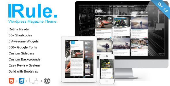
| Rule is a clean, transparent, super flexible, retina-ready and fully responsive WordPress Theme (try resizing your browser), best suited for magazine websites, blog websites, and users who want to showcase their work on a neat portfolio site. Theme is powered by the SMOF Options Panel, which provides tons of options to manage and modify any aspect of the theme – it is well suited for both beginners with no coding knowledge and developers. It comes with 8 custom widgets, 8 widgetized areas , |
Key Features
 Super-duper customizable 6 Home page layouts Retina-ready Unlimited Sidebars Custom Backgrounds Support RTL languages Super-duper customizable 6 Home page layouts Retina-ready Unlimited Sidebars Custom Backgrounds Support RTL languages |
8 Widgetized Areas 8 Custom Widgets Easy Review System Responsive Design AJAX Thumbnail Rebuild SEO Ready |
Minimalistic Design Font Awesome Icons Schema Microdata Highly Customizable Built with Bootstrap And much more… |


