
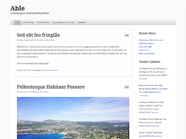
Able is a multipurpose traditional blog theme that is a refresh of two older classics,Andreas 04 and Andreas 09.
It retains the spirit of its predecessors — Able contains up to a three-column layout, a grayscale color scheme, and large layout — while offering an updated look that is clean, responsive, and highly readable.
Custom Background and Header
Add a personal touch by uploading a Custom Header Image or by taking advantage of the Custom Background feature.

Custom Menus
Two custom menus are supported. The Primary Navigation Menu will fall back to a list of pages if it has not been manually configured and saved, while the Footer Menu—which is shown at the bottom of your site—will only be displayed if it has been manually configured and saved.
Full Width Page Template
Able comes with a full width page template, which means that even if you use sidebars throughout your website you will still be able to display full width page features on an as-needed basis.
Responsive Design
Able is a responsive theme, adapting to the screen sizes of iPhones, iPads and other mobile devices. Want to see it in action? Grab the corner of your browser window and make the window smaller or open your site using a mobile device!
Quick Specs
Custom Header (all measurements in pixels)
- The header image dimensions are 1280 by flexible value (width, height). The header must be shown at 1280 wide but any height will do.
Content Width (all measurements in pixels)
- No widgets active, single column post layout: 1176 maximum content width
- Left Sidebar Widget or Right Sidebar Widget active: 869 maximum content width
- Left Sidebar Widget and Right Sidebar Widget active: 562 maximum content width
Sidebars (all measurements in pixels)
- Left Sidebar: 207 maximum content width
- Right Sidebar: 207 maximum content width
Keep in mind that the above values assume that the theme is being viewed at its maximum width (1280). This theme is responsive, so on smaller screens the above values will be smaller than stated.


