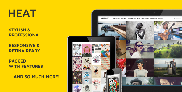
Introducing Heat
Heat is a Premium Portfolio WordPress Theme with a very unique layout especially suited for photographers, illustrators, graphic designers, art and creative directors, architects, luxury businesses or bloggers. It’s equally adept at showcasing design or photography projects. Its page templates accommodates multiple galleries, each with as many images as you want.
Heat comes loaded with customization options, making it easy to get exactly the look and feel you want for your site.
The theme was made to not only look and behave great in the latest desktop browsers, but in tablet and smartphone browsers via responsive CSS as well.
It is built to support new HTML5 elements and syntax and progressively enhanced with CSS3 components for ultimate style.
Sophisticated Portfolio Page with a “Masonry-Style” Layout

Masonry arranges elements vertically, positioning each element in the next open spot in the grid. The result minimizes vertical gaps between elements of varying height, just like a mason fitting stones in a wall.
Touch Navigation Super Smooth Hardware Accelerated Slider

Slider doesn’t have thousands of fancy transitions, but every that it has is as smooth as current day technology allows.
Single Projects with an Innovative, Horizontal iosSlider

Using CSS3 for supported iOS, Android and WebKit browsers.
Full Width Infinite Image Gallery Page with a “Masonry-Style” Layout

An exquisite jQuery plugin for magical layouts.
Touch Enabled Super Smooth Image Gallery Lightbox

Provides your visitors with a familiar and intuitive interface allowing them to interact with images on your website.
Full Width Smart Lazy-Loading Home Slider

Slider automatically preloads nearby images, which makes users spend less time on waiting until image is loaded.
Full Width Video Gallery Page with a “Masonry-Style” Layout

Show your Youtube, Vimeo or Dailymotion videos that will open in the lightbox.
Full Width Google Map and Contact Infos

Show your business location and contact information.
Responsive Design

The theme was made to not only look and behave great in the latest desktop browsers, but in tablet and smartphone browsers via responsive CSS as well.


