
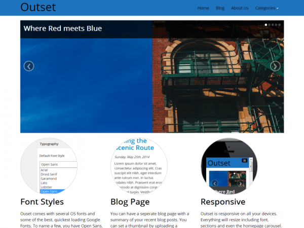
Outset is a responsive WordPress theme using the Twitter Bootstrap. We have also included the Options Framework plugin which lets you customize your site completely. It also comes with a Front Page which includes a slider and call to action sections with images. The Theme Options lets you set a global font style. You can set a common OS font or choose from ten of the most popular Google Fonts including Open Sans, Oswald and Lato. Get Outset now and start something awesome!
Responsive theme design. Outset is built using the Twitter Bootstrap. Everything on the theme is responsive which lets users view your site’s content on any device. Images, Font and Containers will all reduce in size accordingly to fit the screen.
Theme Options. One of the best features of Outset is its customization. You can customize most of it without having to code. You can easily change options from Appearance > Theme Options. Options include changing Navigation color, uploading Logo/Footer, Slider and Front Page settings and much more.
Carousel. The Carousel is an amazing feature in Outset. It lets you upload five different images along with links which are responsive just like any other element. The carousel has a simple slide action and resizes on all devices.
Front Page. Front Page has a carousel at the top followed by five call to action sections. The first three can hold your most important content snippets along with images. Further down, there are two bigger call to action sections.
Blog Page. A very simple blog page which loads your posts, along with thumbnails which can be set from the Featured Image section and a small excerpt of each post. You can set the number of posts to show from the Reading section in WordPress settings.
Fonts. Outset comes with five OS fonts and ten Google Fonts. We have chosen the best Google font styles and you can choose it from the Appearance > Theme Options page. Any font style you choose has a site wide effect.