
Preus is an absolutely Free WordPress theme, built on the powerful Mobile First Bootstrap 3.0 Framework, from Twitter. While designing this theme, we have given utmost importance to speed and comaptibility with modern devices. The theme doesn’t use any image for theme components, and is built using vector icons. This makes your theme 100% Retina Display Comaptible. The theme is fully responsive on all Devices ranging from Huge Desktops to Smartphones. Preus is one of our best creations till date. We hope this theme provides you with what you were looking for your amazing WordPress site.
Product Description
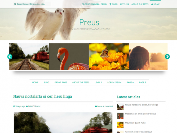
Preus is a High quality Responsive Magazine theme with a refreshing layout and a Minimal Design. Preus fashions a a Full High definition parallax header image, which is optional. The design of the site is suitable for General Magazine or Blog Layouts. The pro version of this theme also supports addition of a Corporate or Business page, where you can showcase your portfolio as well.
Here are the Complete Features of Free Version of the theme at a Glance.
- 2 Column Layout.
- Parallax Header
- Fully Responsive Design
- Custom Background Support
- Retina Ready(HD/Vector Icons)
- 5 Level Nested Comments
- Support For Galleries
- Fully Styled Comments and Posts section
- SEO Ready
- Twitter Bootstrap 3.0 Framework
- Major Social Network Icons
- Translation ready(.pot File Provided)
- Featured Thumbnails
- Cool CSS transition Effects
- User Friendly Control Panel
- 3 Column Footer Layout
- 2 Navigation Menus(Both Responsive)
- Detailed Documentation
- Easy to Remove Footer Credit Links
- Full Width Layout For Pages
- Responsive Carousel
- Nivo Lightbox for Blog Page images
- Recent Posts with Thumbnail Widget
- User Friendly Time/Dates
- Numbered Page Navigation
- Option to choose right/left sidebar layouts
- Separate Footer Sidebar with Customizable Columns
- Regularly Updated


