
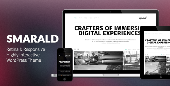


Smarald is an incredibly unique, highly interactive, retina ready, responsive WordPress Portfolio theme, suitable for all sorts of creatives, agencies and even blogs. Whether you want to showcase your work in a beautiful way, share your articles with your readers, or just to have a great presentational website for your agency, you have chosen the right theme for it – Smarald.


A short theme introduction
Smarald was built using the WordPress best practices, and based on all of my working experience, I think I’ve crafted the most intuitive, easy to use, user friendly, future proof WordPress theme to date (and I’m going to continuously update it to make sure it is so). The user experience has been carefully thought to be as easy, pleasurable and intuitive as possible, through the use of CSS3 animations and transitions that make the experience of using a website engaging & immersive.
Speed was also one of our main goals for this theme. Loads insanely fast (under 0.5 seconds!) on a quality host like WP Engine. Here’s some Proof.
When I said this theme is responsive, oh boy, it truly is. The theme is contained on a grid of 1200px in width and when it is viewed on a tablet, or a mobile phone, it easily adapts to the device it is being viewed on. Touch swipe support has been enabled on certain elements, like sliders, portfolio navigation or even single posts navigation. Just swipe your finger on your tablet or phone in the desired direction, where the navigation arrows appear, to test this out.
You can easily alter the width of the grid, change the color scheme (light / dark) or alter theme colors, by using the new WordPress Theme Customizer which was introduced in WordPress 3.4. You can also setcustom backgrounds on a per post / page basis.
I have ensured the theme is retina ready, but also when a retina screen will become obsolete, and we will have even higher pixel density screens, by using SVGs instead of images I made sure your website will look beautiful on devices which are yet to be created ")
Viewing the theme on a smartphone, you’ll notice our unique off-canvas menu, a feature never seen before on ThemeForest, which features beautiful CSS3 animations and transitions that make the user interface much more intuitive and easy to use.
I am also open to suggestions, and if I think they are viable solution for the theme or requested by enough people, I’ll add them nevertheless. Thanks for reading this till the end. This is only the beginning.
Theme Features
- Responsive Design
- Beautiful CSS3 animations & transitions
- Retina Ready (SVGs used)
- Easy to Use & Extremely Intuitive
- No Lock-In effect (You won’t lose content when changing themes)
- WordPress 3.5 Ready (Already working on 3.6 full compatibility)
- Theme Customizer Support
- Easily change colors, color scheme
- Or a logo, or the width of the content wrapper
- Powerful Page Builder (extremely intuitive, very similar to WordPress Widgets)
- Touch Swipe Support
- Unlimited Portfolios
- Portfolio types: images, slider, video
- Post Formats (aside, standard, image, gallery, audio, video, quote)
- Enhanced for Performance
- Favicon support
- WordPress 3.0 Multi level drop-down menu
- Free Basic Theme Support
- Cross-Browser Compatibility FireFox, Safari, Chrome, IE8, IE9, IE10
- Well Organized & Commented Code.
- PSD File included.
- Extensive Documentation (PDF and Video)
- Demo content Included
- Full Localisation Support (contains .po/.mo files) / WPML compatibility
- Compatible with the Icy Social plugin.
- Compatible with the Icy Portfolio Posts plugin.
- Compatible with the Aqua Page Builder by SyamilMJ.
- Compatible with the WP-PageNavi plugin.
- Compatible with the Contact Form 7 plugin.


