
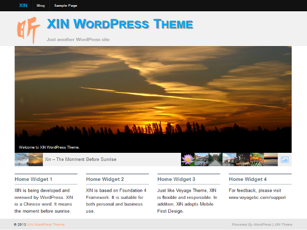
Introducing XIN, another Flexible and Responsive theme by the Author of Voyage Theme. XIN is based on Foundation framework which is mobile first, semantic and has flexible grid system. XIN has a responsive sidebar system that adjust the sidebar positions according to screen size.
Features
Layout
- 12-Column Grid
- Mobile First Design
- 1-, 2- or 3-Column Blog Layout
- 14 Widget Areas for Custom Layout
- 2 Menu Positions
Page Templates with Template Option
- Featured Home Page
- Blog Full Post
- Blog Summary with user definable columns
- Full Width Page
- Portfolio with Infinite Scroll
- Portfolio with Ajax and Tag Filters
Widgets
- Multi-Column Recent Post with Thumbnail
- Tabbed Site Navigation
Other Features
- Post level options: Layout, Read More label, etc.
- XIN Theme is Search Engine Friendly.
Translations
We need your help to translate into your local language. If you want to contribute, please create a POEditor.com account and then contact me. I will add you as a contributor.


